Choosing Color Without Reopening the Decision
Color decisions stay open because color carries emotional weight, and emotion makes commitment harder.
This conversation is about why paint decisions are so easy to second-guess, even after the “right” color has technically been chosen. Because something essential hasn’t been fully accounted for yet.
Sarah Jo of SJA Interiors works at the intersection of color analysis and lived experience. Her work focuses less on picking a shade, and more on understanding why a choice feels settled in one home and restless in another.
As you read, notice where your own color decisions tend to reopen.
That’s where closure is still waiting.

Image | Sarah Jo from SJA Interiors
Color and Emotion: How Interior Design Shapes Your Mood
Color affects a space through more than preference : perception, light, and emotional response all play a role.
Sarah: Like many people, color has fascinated me from an early age and I have always had strong opinions and feelings about color. When I was studying interior design at university, we learned about the psychology of color and how it affects human perception and emotions. I wrote my color theory thesis on the psychological effects of paint color perception in interior spaces. I am highly sensitive to colors and have spent years studying and perfecting my color analysis methods. About three years ago, I began offering color consultations as part of my firm’s interior design services.
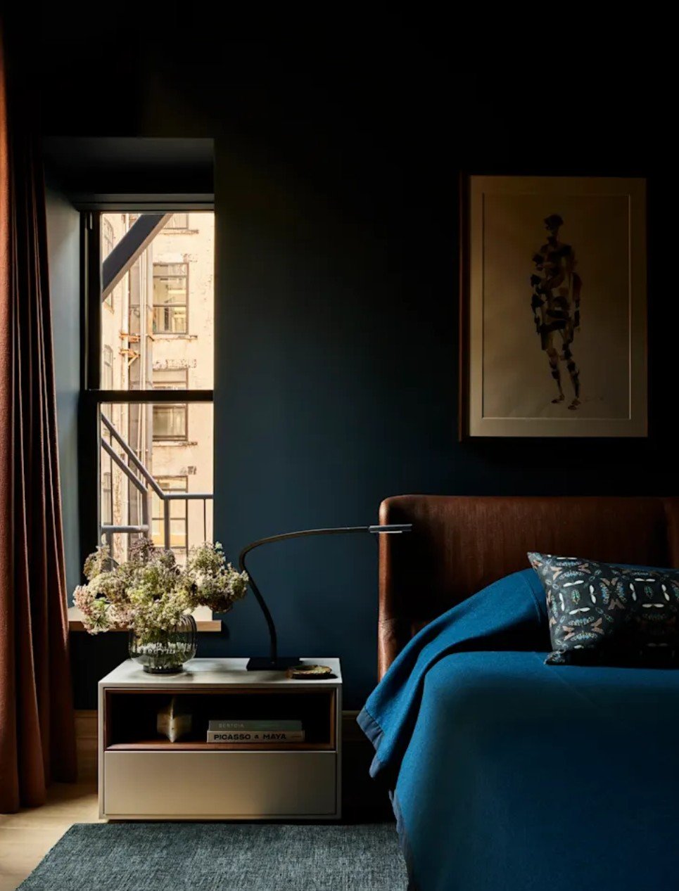
Photo: Nicole Franzen
Design: Kate Taylor Interiors
Styling: Darwin Fitz
Breaking Down Color Psychology for Beginners
Color affects more than appearance , it shapes mood, perception, and how a space is experienced over time.
Sarah: There is an overwhelming consensus in the scientific community that there is a correlation between color and human emotion. Color is a powerful media through which to express or influence emotions, especially in interior design. The hue (color itself), value (light or dark), and intensity of colors can influence mood, attention, distance, size, and perceived temperature of a space.
In general, warm colors are stimulating while cool ones are quieting. Black, white, and grays evoke a subdued response. In terms of value, the lighter a color is, the cheerier the mood where as darker colors evoke restfulness. If a color has high intensity, the mood is stimulated, whereas low intensities bring a feeling peace. Warm hues attract more attention while cool hues attract less— extreme values attract more attention as do colors with high intensities.
Colors also affect the perception of distance. Warm hues, dark values, and high intensity colors advance or make a space feel smaller, while cool hues, light values, and low intensities recede making a space feel larger. The perceived temperature is also affected by color in that warmer hues make people feel warmer and cooler hues make them feel cooler.
As an interior designer, I am always intrigued by people’s emotional responses to their surroundings. I know that the colors I select for an interior can affect my client’s emotional experience of that space. Some colors that are pleasing to one client may be the opposite to another. An interior designer is responsible to make sure the colors that he or she selects are harmonious not only with each other, but also with the client’s lifestyle and personality.
(Image credit: livingetc)
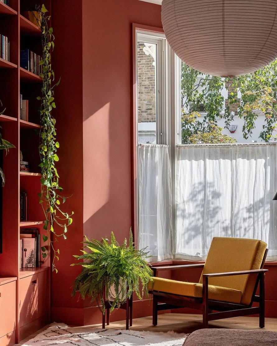
Common Myths About Color in Interior Design
Many people approach color with inherited “rules” that don’t actually serve how they live.
Sarah: Most of the common myths I encounter in my color consultations revolve around so-called “rules” of interior color, akin to fashion’s “Don’t wear white after Labor Day” rule. Some of these traditional opinion-based rules may sound like, “Dark color shouldn’t be used in large amounts or in small spaces,” or that “bright, saturated colors aren’t appropriate for residential spaces,” or that certain color combinations are to be avoided. I believe that color selection is highly personal and should be a fun and enjoyable process.
Ultimately, if you love a particular color in your space, that’s truly all that matters. Some common mistakes I see are clients not taking into account the way natural and artificial lighting will affect how a paint color is perceived. Also common is clients forgetting to account for how the colors of their furnishings and flooring materials will be affected by a particular paint color and vice versa.
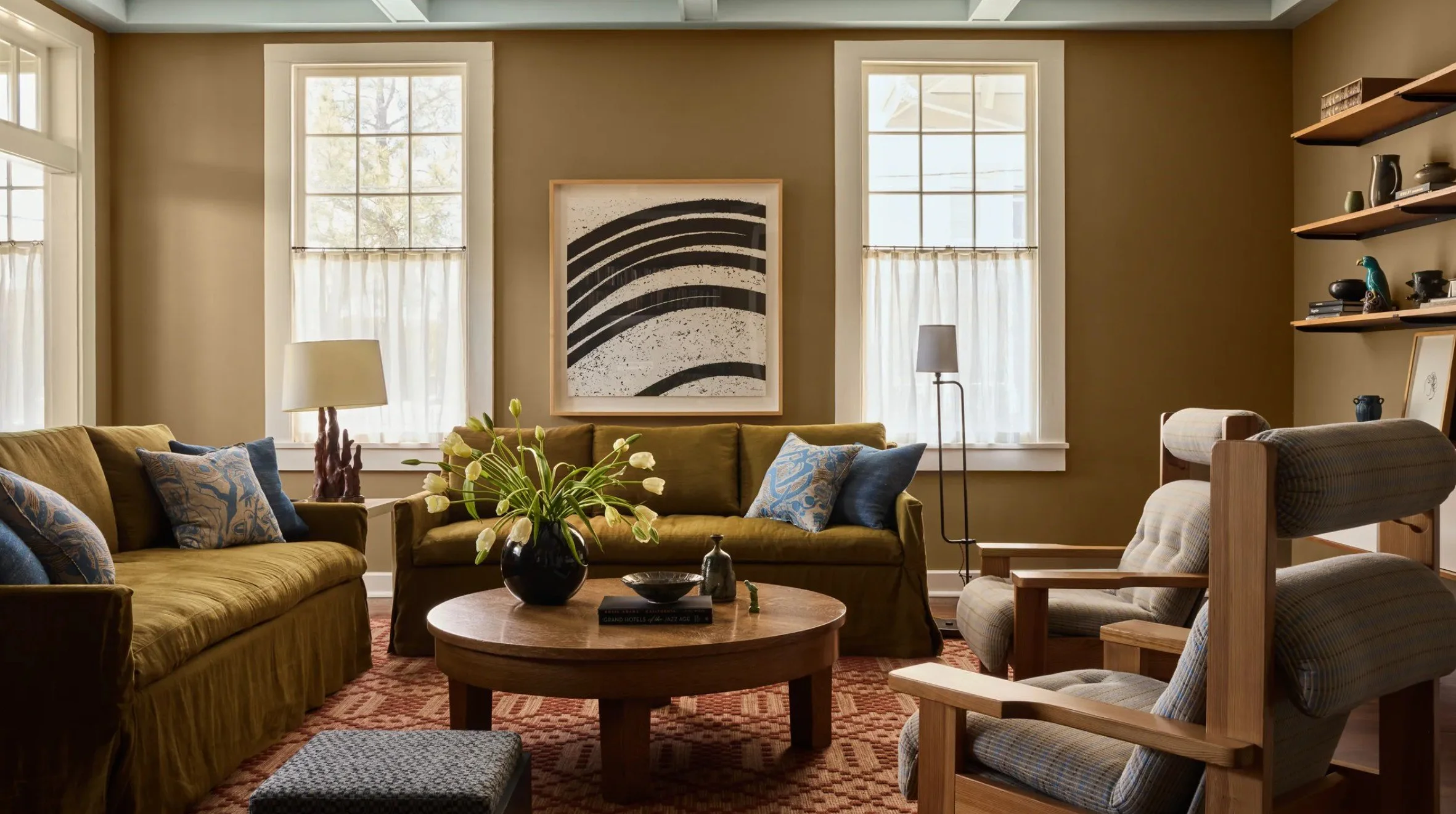
Image: architecturaldigest
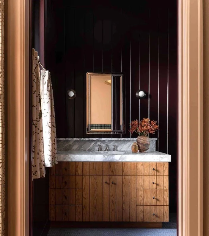
How to Choose Colors When You Feel Overwhelmed
Overwhelm around color usually comes from trying to decide before enough context is clear.
Sarah: When I have a client who feels exasperated by color selection, I begin with a simple visualization exercise to help them get their creativity flowing. We then turn to inspiration images which are an absolute must for indecisive clients. Once we have a general idea of a color family or overall style, we can begin to look at specific colors and gauge my client’s emotional response to those colors. From there, it’s usually quick work creating a paint palette that they love.
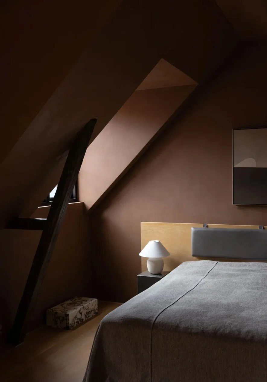
Image: livingetc
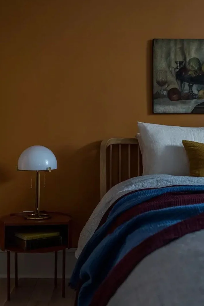
The 60-30-10 Rule for Home Color Palettes
Some frameworks can help decisions stick, as long as they’re used to support clarity rather than replace judgment.
Sarah: Obviously white is a universally accepted paint color for many homes. White is timeless, can coordinate with anything. But that being said, there are thousands of whites to choose from such as a warm white with yellow undertones, a cool white with blue undertones or balanced between warm and cool. Choosing the right color for any given space is dependent on several factors: the color perception of the inhabitant, the natural and artificial light sources in the space, the size and volume of the space and the furnishings and finishes in that space.
Once you have taken in to account those factors, using the 60-30-10 rule can be helpful when creating a whole-home palette. This means 60% of your home would be your main wall color(s), for example maybe a neutral or soft white in main living areas, 30% of your walls should be coordinating accent colors in secondary rooms such as bedrooms, bathrooms, home office, etc. and 10% of your home will have a pop of color for example, brightly colored powder bath or sleek black cabinetry in a kitchen or at a wet bar.
My custom color palettes were born out of a desire to share my color expertise with a wider audience than just my private clients. I had amassed so much color experience over my 15-year career and I wanted to share everything I had learned with as many people as possible. My goal was to make paint color decisions easier and less intimidating for those who maybe don’t feel as confident in their design instincts and just need a little nudge to go bolder or darker or brighter.
Choosing color for your home shouldn’t be scary, it should be a fun and exciting process and that’s what I hope to bring to people through my palette collection.
Image|The Spruce
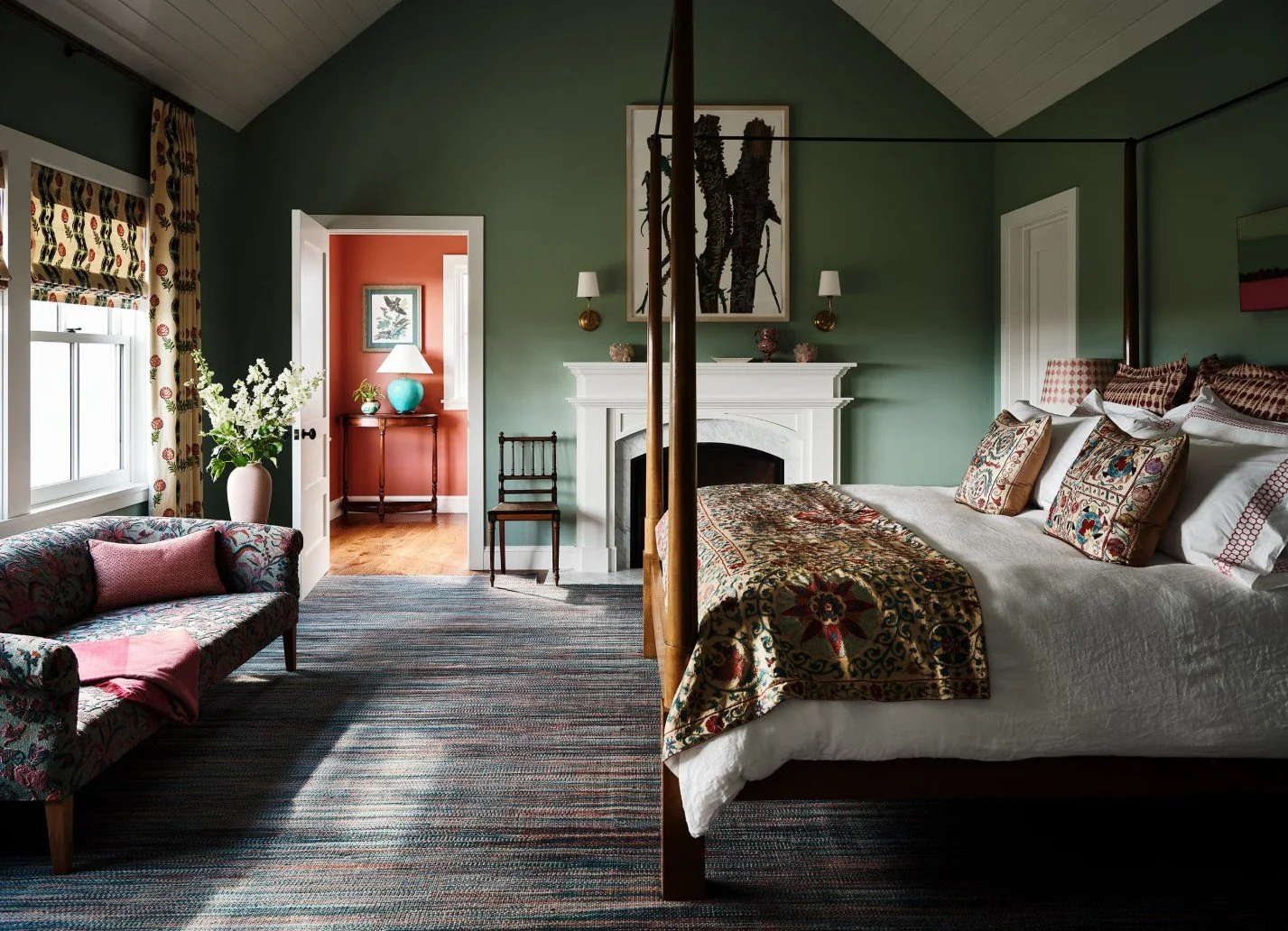
A Moment Where Color Helped Someone Settle
In some situations, color decisions carry emotional weight far beyond aesthetics.
Sarah: Absolutely. I had a client who had recently received a serious diagnosis. She was in a rush to choose colors for a new home she was planning on living in with (and ultimately leaving behind for) her adult child. She wanted peaceful and soothing colors inspired by the landscape surrounding her home.
She, her daughter, and I worked diligently to craft the perfect palette for this home where they wanted to create lasting memories. Once it was complete, my client said her anxiousness was gone and she felt so at peace knowing this home was complete. She said the vibe of the house felt exactly how she wanted it to and she was so grateful to be able to pass this special gift down to her daughter.
That was one of the most moving and incredible experiences I have ever had with a client.
Image| housebeautiful
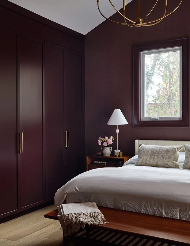
Trends vs. Long-Term Satisfaction
Trend awareness only becomes useful when it doesn’t override long-term satisfaction.
Sarah: I may keep trends in mind in my designs but overall I don’t follow them explicitly. I may draw from a trend that a client is drawn to in order to spark inspiration but ultimately, color selection is a deeply personal process that is unique from client to client. The timeless feeling comes when the client and I find a palette that achieves the vibe they are looking for which then translates into long-term satisfaction with their space.
Image|Elledecor
Trying Bold Color Without Reopening the Decision
Confidence with color often comes from seeing a choice in context before committing to it.
Sarah: A great way to “try on” a wall color, so to speak, is to use large peel and stick paint swatches available from many paint retailers. Another great tool are the virtual color visualization applications many paint manufactures have where you upload a photo of your space and the color is digitally applied to the walls. Alternatively, you can hire a designer like me to do a color consultation.
As a part of my custom palette projects, I render the paint colors onto your interior walls or exterior surfaces so you have a visual of what the colors will look like in or on your actual home.
Light, Color, and Why Paint Changes
Light direction and quality dramatically affect how color is perceived in a space.
Sarah explains how directional light affects color perception:
North-facing rooms benefit from warmer or balanced tones
East-facing rooms change throughout the day
South-facing rooms can handle cooler or darker colors
West-facing rooms warm significantly in the afternoon
Artificial light matters too. Bulb temperature and CRI affect how accurately paint reads. Natural light is always the most honest reference.
Artificial light similarly affects color perception. The Kelvin color temperature of a light source casts cool to warm light on surfaces depending on the bulb’s Kelvin value, usually between 2700K and 3000K for incandescent bulbs and 2700K to 6500K for fluorescents and LEDs.
The Color Rendering Index (CRI) of bulbs tells us how well a bulb will show an object’s “true” colors. A paint color will appear “truest” under natural light so a bulb with a CRI closest to natural light, between 90-100, will render the paint color most accurately.
“Bold, gorgeous colors are in and they are not going away anytime soon.
The sad, overall gray palettes of a few years ago are out and in their place come cheery pastels, bright jewel colors and earth tones.”
Photographer: Niamh Barry
Source: House & Home
Designer: Olivia Botrie
On “Bold Color” as a Movement
Broader shifts in color use reflect a growing comfort with expression rather than neutrality.
This rainbow of gorgeous hues opens so many exciting possibilities for interiors from maximalists to minimalists and everything in between and I am here for it! I am also loving how painting ceilings and other unexpected places like trim, is having a moment. Adding color to unexpected places like that is another interior color movement I am fully embracing.
What matters most in this conversation isn’t permission to be bold or subtle.
It’s understanding why color decisions only settle when they’re grounded in context — light, existing materials, and how someone actually lives in a space.
When those factors are accounted for, color stops feeling risky. It becomes something you can choose once and live with.
If you find yourself reopening the same paint decision, the issue usually isn’t taste. It’s that something essential hasn’t been fully considered yet.
If you want a deeper reference point, Sarah Jo shares her full color framework in her guide, Choosing the Perfect Paint Color: A Comprehensive Guide. It exists to support clarity, not to keep decisions open.
That’s when the decision can finally close.